
Design patents are pretty simple things, relative to the more common utility patent. A design patent just protects the look of a thing, so it is mostly governed by its drawings. Here’s an example: https://patents.google.com/patent/USD525009S1/
Now, that is not the drawing that was originally filed. The original drawing looked like this:

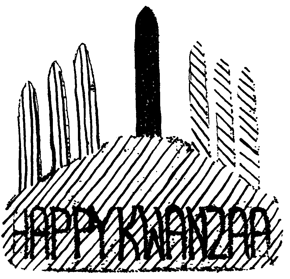
So what happened? Why did the drawings go from the clear picture that was originally filed to the mess that was actually patented? The patent examiner actually required the inventor to make the change.
In this case, the center candle is supposed to be black for the African people, the left three candles are supposed to be red for the blood shed in the pursuit of freedom, and the right three candles are supposed to be green for the land, mirroring the colors of the Pan-African flag. There are different interpretations for the colors, so hopefully I got that approximately correct.
The problem is that the USPTO accepts drawings mostly in black and white. If you want a design patent drawing to have specific colors or textures, you need to use specific kinds of cross-hatching and stippling. For example, the vertical lines of the final drawing represent the color red. Since color is so important to the design, the final version ended up being a mess of lines. It doesn’t look great to the layman’s eye, but I promise, it all makes sense!
